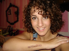
This picture is my destroyed on of my bubby and I. It is ripped in the arm and folded across his shirt which I chose to do because both have many different tones that needed to be blended and worked on for it to really look realistic.
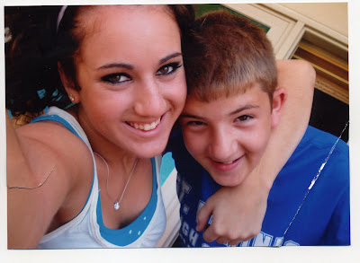
This photo is the fixed version of my bubby and I. To be honest, I didn't really think it was going to take as long as it actually did. I am happy with the way it turned out but in hindsight, I think it would have been neat to try a few other kinds of pictures like black and white or a really beat up old picture. Using these tools to touch up has really showed me how much you can do with photoshop. This was my best work in Photoshop.
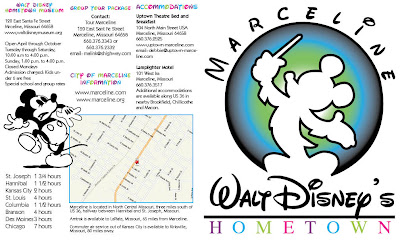
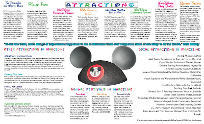
These two pieces are my best work from InDesign. This piece was particularly difficult because of how much text needed to be crammed into such a small space. My favorite part is the front of the brochure. Initially, the front was all black but I really wanted to add more color so I started to mess around with the HOMETOWN title at the bottom. Then i decided it still needed more so I added the circle in the back of Mickey. Another thing I really like about this piece is the coloring of the titles. I think that is one of it's stronger attributes. Also, the organization of the whole brochure is a strong part of the piece. Out of all of my InDesign pieces, this one took me the longest but in the long run is definitally my favorite!!
 This picture is my destroyed on of my bubby and I. It is ripped in the arm and folded across his shirt which I chose to do because both have many different tones that needed to be blended and worked on for it to really look realistic.
 This photo is the fixed version of my bubby and I. To be honest, I didn't really think it was going to take as long as it actually did. I am happy with the way it turned out but in hindsight, I think it would have been neat to try a few other kinds of pictures like black and white or a really beat up old picture. Using these tools to touch up has really showed me how much you can do with photoshop. This was my best work in Photoshop.
 These two pieces are my best work from InDesign. This piece was particularly difficult because of how much text needed to be crammed into such a small space. My favorite part is the front of the brochure. Initially, the front was all black but I really wanted to add more color so I started to mess around with the HOMETOWN title at the bottom. Then i decided it still needed more so I added the circle in the back of Mickey. Another thing I really like about this piece is the coloring of the titles. I think that is one of it's stronger attributes. Also, the organization of the whole brochure is a strong part of the piece. Out of all of my InDesign pieces, this one took me the longest but in the long run is definitally my favorite!!